- March 14, 2018
- gscadmin
- Blog
If you have reports, dashboards, alerts and trackers in your office – congratulations! You have cleared the “driving without headlights in the dark” phase of business. My endeavor in this article is to help you find out if that head-light is a 3W pencil-light or a 150W quartz-halogen power-light. The difference, I wish to throw light on, has really nothing to do with amount and type of data. It has everything to do with what and how data is presented.
Imagine you are being chauffeured from Chennai to Bengaluru. A running car, if you can imagine, has 300 different data points in several computers. They are important for determining the health of the car and also its progress towards your destination. Computers get data from diverse sensors and switches about temperature, pressure, voltage, flow of different gases, acceleration at different angles, braking, yaw and roll of the vehicle, steering angle and many more. Your car will have more data if it also has telematics systems.
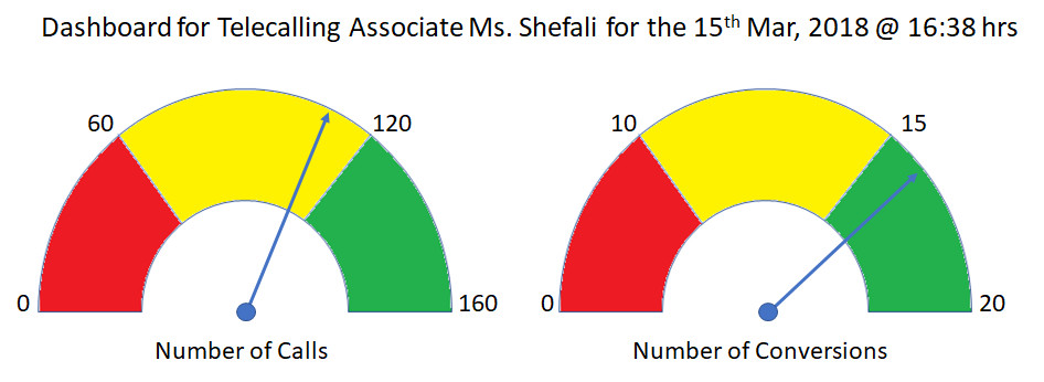
But, the dashboard contains just the tachometer, fuel gauge and speedometer with four crucial data (output: speed of vehicle, distance covered and input: fuel level and speed of engine) for your trip to Bengaluru. Nothing more! And importantly, it is for the driver to see in real time. Just imagine a car with you in the back seat having the dashboard and the driver having nothing. Hilarious! If you can imagine so, you will also infer that the driver cannot take any decision to alter speed and fill fuel in time, especially if you are asleep or busy with someone (talking, of course!). So, a dashboard in a firm is an electronic display of a few specific real-time and altering data crucial for - not her boss, not her colleague – but for the immediate actions of an employee.
Further, imagine a month-end report of what the daily average driving speed, total miles and average fuel levels were to the driver! Sounds familiar? Just as a delayed report makes no sense, certain data do not make sense to be included in a Dashboard either. For example, “Revenue per Employee” - to a CEO and computed year-to-date and fed real-time to a monitor. As you can imagine this number will not change even over a week. Such can shift to a report and is usually served offline over email. Here a typical dashboard:
On the other hand, report is a summary to monitor how different areas of business are performing. Ask a car service center. They would pull out reports of several parameters recorded from the past drive-times and also take spot reports of how healthy the parts are. For example, how you drove in the last one month and how the internal systems responded. They could tell you that you rev the engine a tad too much and ride the clutch too – two important aspects for engine health and fuel consumption. I am sure you noticed that service center reports contain both the inputs and the outputs. Most organizations miss reporting on the inputs. For e.g. what were your advertising spend and sales force count (inputs) and what was the sales (output)? If relationships are clearly known, the trends will inform us what to do in the next period to influence sales.
One of the most important aspects of a report is its frequency. I see several employees who get daily reports on so many parameters and not even opening them! I had an uncomfortable feeling when I saw one very senior person’s email inbox appended with a number “(8000+)”; most of it was unopened emails containing reports. I do not blame her – we all suffer from “report blindness” and later squeamishly wriggle when someone accusingly says: “I have been sending you daily reports on that”. My suggestion is to ruthlessly par the number of reports, by any channel – email, mobile or SMS - per person to just five per day. And manage the frequency of reports well. The key question is what should the frequency be? For starters, the time it takes for you to yearn for one.
I was associated with an organization that reviewed a specific number every day even when it did not show any perceptible change over several weeks. Logically, frequency of a report is a function of how long does an action or program takes to perceptibly alter a key metric. Imagine web site visits and leads data. If we started an SEO program, one needs to revisit the data only a quarter later – for it takes that long to impact. Why would you look at the data earlier and every day? And agonize over no change?
If at all a report is featured online, it must be enabled with exploratory features such as drill-up and drill-down. For example, last two years’ sales data can be drilled down to their individual components such as products, divisions and geographies. The refresh rates for such online reports can be at the same frequency as that of offline ones such as email.
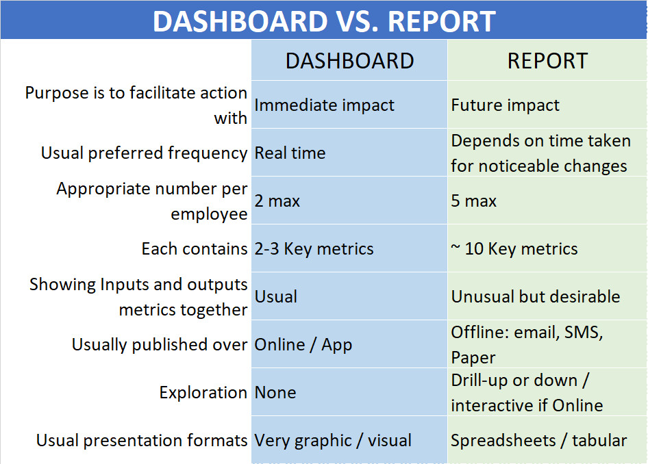
Before I take up alerts and tracker, here is a recap on Dashboard and Reports:
Please watch this space for what is an Alert and Tracker.
Categories
Recent Posts
-
 Goal of AI: Human empowerment or
Apr 08, 2021
 How to foster motivation? The material
Nov 03, 2020
 How to destroy motivation?
Nov 02, 2020
 WFH – forget Coronavirus – lock-down
Mar 24, 2020
Newsletter
Get regular updates on data science, artificial intelligence, machine


